
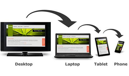
Usually the person who has a new website designed imagines the web engineer in front of his desktop computer working hard to develop the project.
With the new trend of massive monitors, 21, 27 or more inches, perhaps we lose perspective and concentrate on imagining it on those screens, where visually we enjoy its architecture and visual design and the experience that the size allows.
And it’s true, having a site created to be viewed on desktop and laptop screens is essential, but it’s not everything.
A properly built website must be able to be navigated on desktop computers, as I mentioned, but also on tablets and smartphones, in their range of sizes.
Why?
Number 1
To answer this we can use a fact that I have already published several times on the blog, most people currently use the phone as a tool for browsing the Internet, to search for information through written or voice commands, and access the websites they are looking for from their laptop.
Currently in Mexico there are 79.6 million smartphone users, with a projection of 92 million by 2024, according to an article by Statista. What this shows us is the trend and importance of knowing how to take our communication to a smartphone.
And as users we find it easy, if we open a site on the laptop it displays in one way, if we access it via the phone, it displays a much more slender, practical version, with navigation scheme that works whether we have the screen in vertical or horizontal position.
Websites today must be “responsive” or responsive in Spanish, have the quality to adapt harmoniously to the screen of the device being used by the Internet user.
Number 2

Since 2015, Google announced that, among its main points for rating a site, it would consider its responsive quality. And today, to assess the quality of construction of a website, the priority is the format for smartphones.
And it is logical, a site with too much code and very heavy or disproportionate images, will make your download and navigation slower and more complicated.
We all know that a site that is slow and difficult to navigate is discarded at the speed of a click.
If Google detects a site that is difficult to navigate, it penalizes it, and the chances of being found are also affected.
Number 3
As a user, what would you think after having a business meeting with a businessman, if he gave you his business card or a brochure and when researching him on the web you had problems accessing or navigating his website? What impression would you get? How would you compare what he told you against your experience on his web portal? Definitely, it would be a negative image.
Currently, where people are so used to surfing the web, they can tell when a site is not worth their time and interest, and jump to another one instantly.
Currently, an important point in the image and reputation of companies and institutions resides in their place on the Internet, where users can access it as they wish, in the way they want, without distractions.
Currently, an important point in the image and reputation of companies and institutions resides in their place on the Internet, where users can access it as they wish, in the way they want, without distractions.
Always keeping in mind that the first objective is to maximize the user’s experience.